Google Analytics , in simple words, is a tool which analyzes web traffic, traffic sources and which generates various statistics about them. If you are not professional marketer or webmaster, then it might be a little bit complicated to read out and summarize all important insights for your website.
On the other side, it’s very interesting and more and more popular to see the collected data visualized through an Infographic.
Recently, Visual.ly published a free template
 which can connect to your Google Analytics account, read out the data and then present it into beautiful and understandable Infographic. Besides that, you may enable the option to receive weekly reports directly in your mailbox.
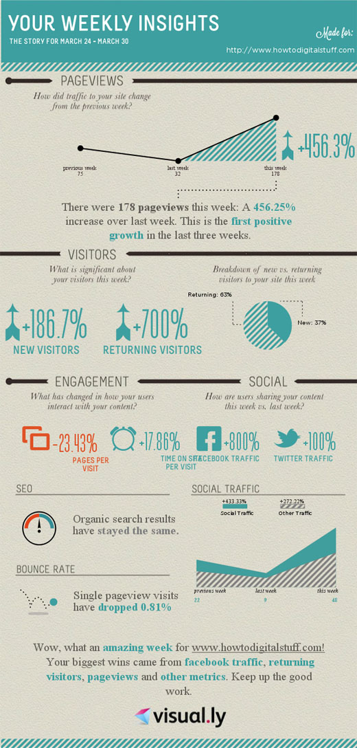
Here is the Infographic for howtodigitalstuff.com, with the data collected from the past week.
One post on our Facebook Page became amazingly viral and brought us new Facebook fans and new visitors to the website!


